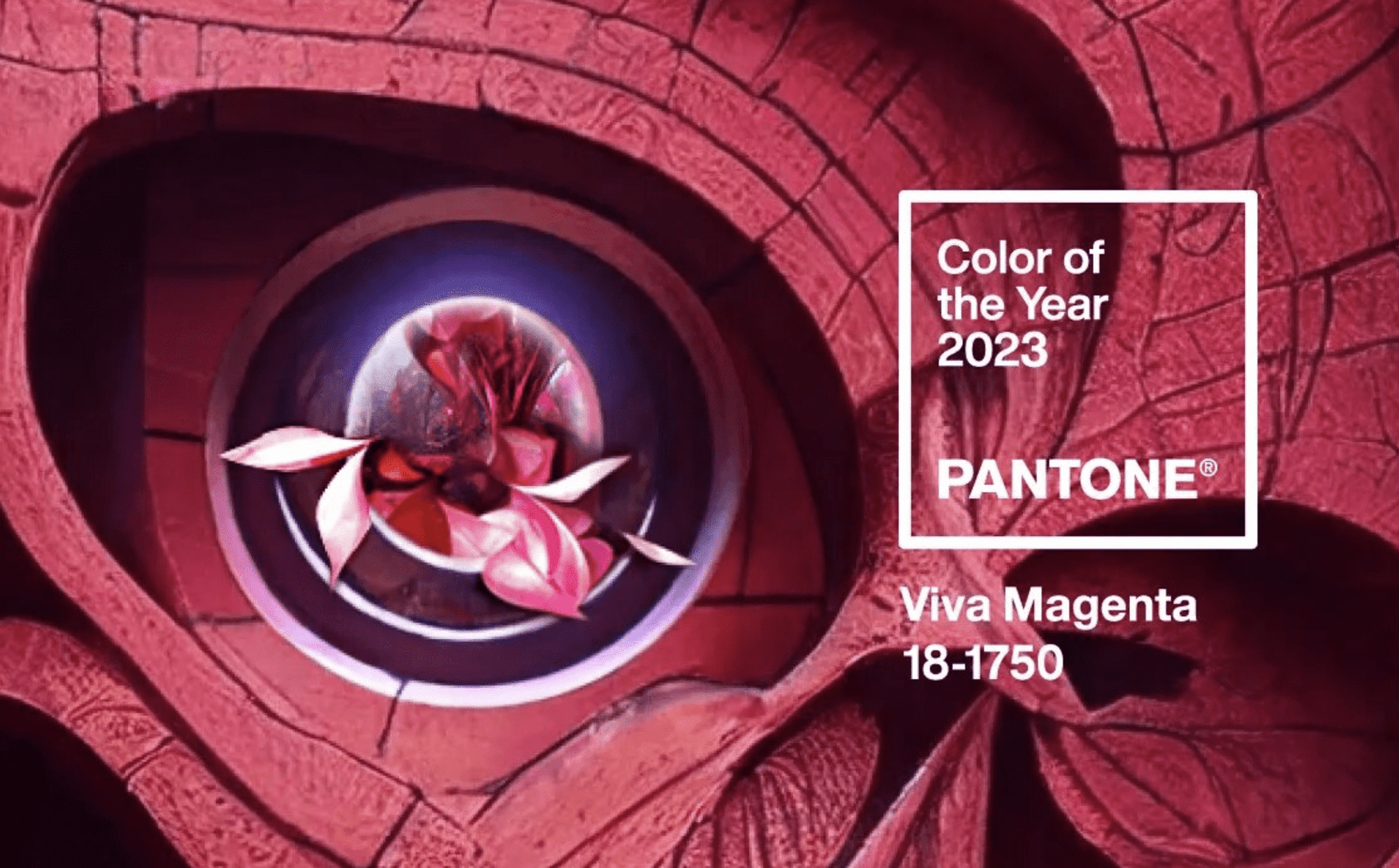
COLOR OF THE YEAR CHOSEN BY PANTONE 2023
The U.S. color expert and most influential company of all time has made the announcement: "Viva Magenta" has been described by the company as "a nuanced shade of crimson; an unconventional hue for an unconventional time."
So this year you'll see it in many products and design objects. You will be able to incorporate it into your design planning for this year.
It is an intense color that connects with nature and has a lot of energy. It is part of the red colors and therefore, it is related to the psychology of this color.
t is an intense color that connects with nature and has a lot of energy. It is part of the red colors and therefore, it is related to the psychology of this color.
Pantone Color of the Year 2023: Viva Magenta
The vivid magenta will be present throughout 2023 in sectors such as fashion, beauty, graphic design, industrial design, technology and home decoration.
In addition to being a trend-setter, the color Pantone selects as color of the year predicts the global mood of this hue. In this sense, Viva Magenta projects a reconnection with nature, since it is based on a naturally occurring pigment. It is one of the brightest and most intense pigments that exist in nature, specifically being in an insect called piglet.
It is a color that psychologically projects joy and optimism. It seeks to inspire energy, innovation and above all a positive mood, because after the pandemic we have renewed ourselves spiritually.

Credits: Pantone.
How does Pantone select the color of the year?
Pantone is the most important global company in color trends. It has a unit of experts specialized in the area, who monitor and analyze cultural, artistic and social trends to determine the colors that will be trendy. Subsequently, they choose a color that is part of the company's catalog and contains the spirit of the times. That is why it serves to determine the general feeling of a year.
You are probably wondering how Pantone came to be positioned as the leading company in determining the color of the year. The story goes back to the 1950s when an architectural and design movement was behind the color revolution. This team was led not only by architects but also by chemists who helped in the creation of colors and in the construction of a catalog. The use of color in printing also marked a turning point as it was realized that color printing required more precision, and an identification system was created to facilitate the process of using color in the design and printing industry.
Pantone's great achievement was to define the pigments needed to use colors and to arrange them in a catalog. At the time of its launch, it had only 500 cards that were presented in the same way as today and were then known as pantoneras. At present, the pantone reference catalog already has more than 2000 colors and every 18 months it is updated and incorporates new references.
This is how Pantone is today considered the most important company specialized in color management.
How to use Viva Magenta in graphic design?
Consumers are overexposed to screens, these are usually neutral and pale, so those who make digital products will find in Viva Magenta a vibrant color that will captivate users. Any brand that by 2023 uses this color expresses its risky, curious spirit will undoubtedly be an attractive color that will captivate all eyes.
In the world of packgaging and plastics the sentiment is the same. Viva Magenta will produce an interesting reaction in the consumer. A Viva Magenta package will stand out on any shelf or display among other products.
Did you like the color of the year 2023? We think it is a very powerful color and at Printu we can reproduce it very accurately.
Information: https://printu.co/wp/blog/diseno/color-del-ano-elegido-por-pantone-2023